From Pixels to Paper: Your How-To Guide for Print Success
Cath Riley
Our first blog, “Why Visual Consistency Matters: The Pain of Inconsistency”, explored the challenges and consequences of a fragmented brand identity. We broke down the marketing headaches caused by inconsistency , from eroded trust to operational inefficiencies, and outlined the key elements to keep your brand cohesive across platforms.
In this follow-up, we dive deeper into the practical steps designers can take to ensure your designs translate seamlessly from digital to print. By focusing on resolution, materials, layouts, and colours, we’ll equip you with the tools you need to maintain visual consistency and elevate your brand across every medium.
As a designer, your work is your passion, your art, and your signature. Every pixel, every shade, and every detail reflects the creativity you pour into your designs. But when it’s time to bring those designs into the tangible world of print, it can sometimes feel like your vision is lost in translation.
Fear not—Northern Print Solutions’ Paul Fenwick shares expert insights to help you maintain the integrity of your designs. Let’s ensure your work shines as brightly in print as it does on-screen.
- High-Resolution Images: Stay Sharp and True to Your Vision
Few things sting more than seeing your vibrant, carefully crafted design come out looking blurry or pixelated in print. It’s a stark reminder of the technical gap between digital and physical mediums.
Why It Matters: High-resolution images are the foundation of print perfection. Designs that look fantastic on a screen at 72 DPI often fall apart when printed. At 300 DPI or higher, every line, shadow, and gradient stays true to your creative intent.
Paul’s Tip: Think of resolution as the brushstroke of print. The sharper it is, the clearer your masterpiece becomes.
- Paper and Material Selection: The Canvas for Your Creation
In print, your paper isn’t just a surface—it’s part of the story you’re telling. Unlike digital, paper carries your design’s weight, texture, and personality. The wrong choice can mute your colours or muddle your details, while the right one elevates your work to a tactile experience your audience won’t forget:
Glossy Paper: A glossy finish can make colours appear richer. Perfect for those bold, vibrant designs that demand attention. Think marketing flyers and product catalogues. .
Matt Paper: When sophistication is the goal, Matt softens tone and adds a premium tactile feel. Perfect for understated elegence
Specialty Papers: Add dimension and character with textured or recycled options—but adapt your design to avoid losing intricate details. For instance, intricate details or small text can become less distinct on heavily textured paper, so it’s crucial to adapt the design accordingly. If you’re leaning into sustainability, recycled paper provides a unique, eco-conscious texture but may alter colour vibrancy due to its more natural, muted base. But don’t be put off by use from using it, especially since it can make a huge impact, just ensure you get your printer to test print swatches and adjust your colour profiles to match expectations.
Paul’s Tip: Your design sets the tone, but your paper choice enhances the emotion. Consider adjusting your colours and elements to complement the paper and create a cohesive sensory experience. Always take the time to feel the paper in your hands—it’s where your vision becomes reality. Oh, and don’t forget to consult with your printer in the choice of paper and the likelihood it will alter you end design!
- Layouts and Margins: Protecting Your Design’s Integrity
There’s nothing worse than seeing your design’s edges awkwardly trimmed or white borders creeping into your masterpiece. These small errors can steal the polish from your work and diminish its impact. Remember these details are the first thing you audience see and are likely to remember.
Layouts, margins, and bleeds ensure your designs don’t just survive the printing process—they thrive. By adding at least a 3mm bleed, you safeguard your vision and ensure the final piece looks as polished as you imagined.
Paul’s Tip: Think of margins and bleeds as your safety net. They protect the integrity of your design, letting it shine without compromise.
In summary, your designs are more than just images—they’re an extension of your creativity and expertise. Consistency across digital and print ensures that your vision remains intact, no matter where it’s seen. By mastering high-resolution images, thoughtful material selection, and precise layouts, you can create print pieces that not only meet expectations but exceed them.
Northern Print Solutions is here to support your journey, ensuring your designs transition seamlessly from screen to paper without losing their soul.
*****Quick Takeaways for Designers*****
– Use 300 DPI or higher to preserve the details that make your designs shine.
– Experiment with papers to match the mood and texture of your work.
– Collaborate with your printer to protect the integrity of your designs
Time to read more
Why Visual Consistency Matters: The Pain of Inconsistency
Cath Riley
Consistency isn’t just nice to have; it’s what sets your brand apart and builds trust. When your visuals speak the same language across both digital and print, your audience recognises you instantly. But what happens when consistency falters? For marketers and brand stakeholders, the repercussions are tangible: confusion, diminished trust, and missed opportunities. Here’s how to avoid these pitfalls and maintain a strong, unified brand image with a focus on colour, fonts, and logos.
Picture this: after months of work on a marketing campaign, your printed brochures display colours that don’t match your digital ads, or a sleek web font looks awkward on a flyer. Along with a couple of gut churning emails in your inbox from the boss, these discrepancies cause real frustrations and challenges for marketers and brand stakeholders, creating a ripple effect throughout the organisation:
Top Six Headaches Caused by Visual Inconsistency
Eroded Brand Trust: Inconsistent visuals can chip away at the trust customers place in your brand. When the appearance changes from one platform to another, it sends mixed messages that compromise your credibility.
Confused Brand Identity: Visual misalignment results in a fractured brand image, making it hard for customers to form a clear and consistent perception of who you are.
Reduced Engagement and Recognition: When brand visuals differ, it affects customer recall and engagement. People may not recognise your brand as quickly, diluting the impact of your marketing efforts.
Operational Inefficiency: Inconsistencies lead to back-and-forth revisions, costing time and resources. Marketers are forced to troubleshoot discrepancies, diverting energy from more strategic and creative tasks.
Missed Differentiation Opportunities: A unified visual presence helps you stand out from competitors. When that’s lost, your ability to assert your brand’s unique qualities diminishes.
Diminished Professionalism: Inconsistent visuals make your brand look unpolished, which can undermine the external perception of your audience on your brand AND the confidence of internal stakeholders in yourself – bye by promotion!
Want some good news? With a few steps, you can prevent these pain points from arising. By understanding the specific elements that contribute to visual consistency and making intentional choices in your design process, you can bridge the gap between digital and print seamlessly. Here’s how to ensure your brand maintains a polished and cohesive presence:
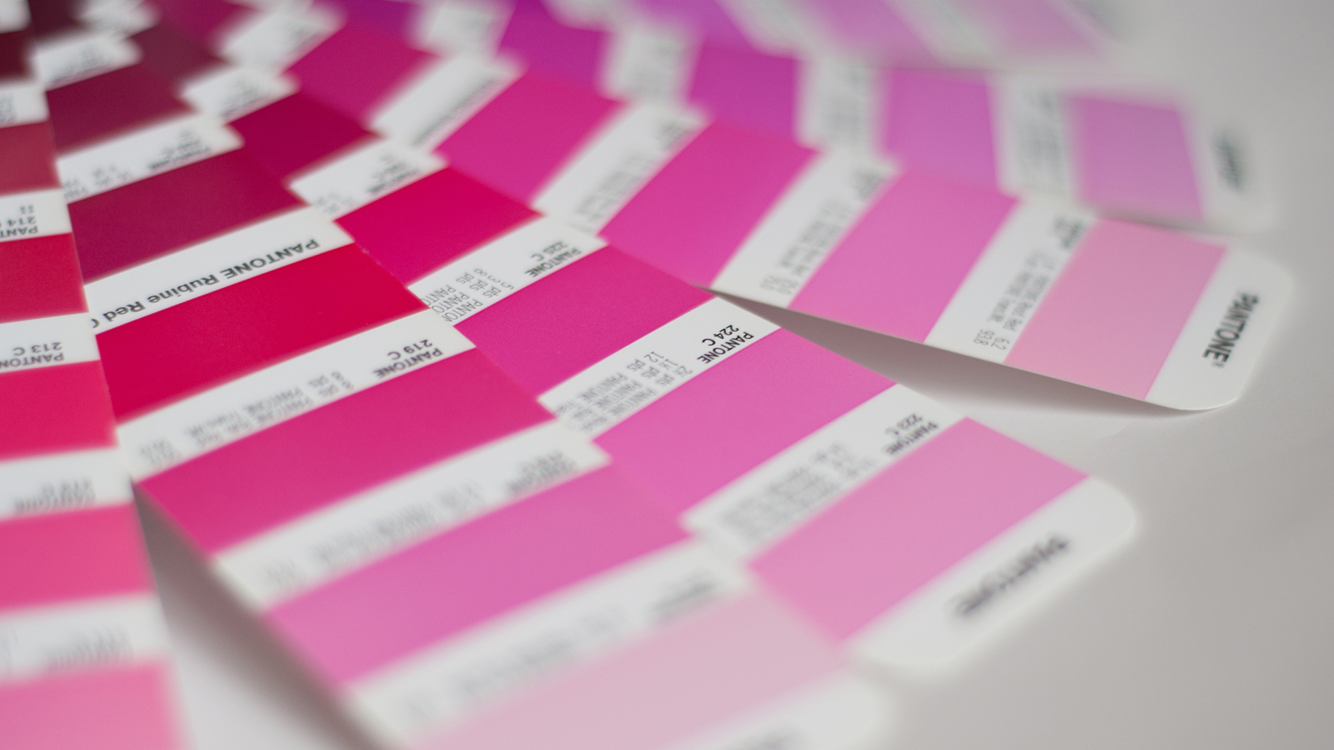
Ensure Brand Colours Stay True With Colour Matching: Digital screens use the RGB model, while print requires CMYK or Pantone. The challenge? These models often don’t align seamlessly, causing discrepancies.
Tips for Colour Consistency:
– Stick to Pantone or CMYK Equivalents: Use Pantone or CMYK to match your RGB palette. CMYK has come a long way, especially combined with the colour management software we use.
– Use Soft Proofing Tools: Predict how your digital colours will look in print to catch any unexpected shifts in hue before production.
Consider Fonts that can Be Used Consistently Across Mediums: Fonts convey your brand’s personality, but not all fonts translate seamlessly from screen to paper. Differences in font rendering on digital devices versus print can impact legibility, which is why maintaining font consistency across both mediums requires your urgent attention
Tips for Font Consistency:
– Digital to Print Fonts: Maintain brand consistency by using your digital fonts in print materials. But we warned some web fonts may not print as intended so check licensed and compatible for print use.
– Size It Right: Print fonts often require larger sizes and adjusted spacing to maintain clarity so adjust both for better readability. Print test pages at different sizes to refine the best fit.
Keep your logs and Icons Sharp: Avoid the pixel pitfall, your logos and icons should stay crisp and sharp, wherever they appear. Blurry visuals not only look unprofessional but erode the power of your brand presence.
Tips for Clear Logos and Icons:
– Choose Vector Formats: Use SVG or EPS files for scalability without losing resolution. quality loss. This is crucial for maintaining clarity in print where pixelation can compromise your brand assets.
– High Resolution Matters: PNGs and JPEGs are often used for digital, but these formats can suffer from pixelation in print. Always go for files of 300 DPI or higher for print. Whenever possible, provide us with vector files for the best results.
Final Thoughts:
Achieving a unified brand presence across digital and print isn’t just an aesthetic decision—it’s a strategic one. Visual cohesion builds trust, reinforces your brand’s image, and ensures professionalism. By focusing on precise colour matching, suitable font choices, and high-quality logos, you set your brand up for long-term recognition and success.
Quick Takeaways:
– Keep a library of RGB, CMYK, and vector versions of your brand assets for easy access.
– Test colours and fonts early in the design process to spot inconsistencies.
– Collaborate closely with your print provider, AKA us!, to ensure you supply the highest quality files.
Time to read more
Festive Opening and Order Information
Cath Riley
Christmas is just under two weeks away, so here is all the essential information you need to place orders before and during the festive season.

LAST BESPOKE ORDER DATE FOR XMAS DELIVERY:
The Royal Mail Industrial action has placed additional pressure on our delivery partners at this busy time of year. We have been advised that delays to your orders are possible. We recommend placing your orders by Monday, December the 19th, to ensure you or your clients receive them in time for Christmas.
For bespoke orders placed between the 20th and the 23rd of December, we cannot guarantee the pre-Christmas arrival of those orders.
BESPOKE ORDER LINE OPENING TIMES
Want to contact a member of our customer service team? We will be operating to reduced hours during the festive period. Call 0191 411 1698 or email hello@northernprintsolutions.co.uk, during our opening hours to place an advanced order for 2023!
From 12.00pm 23rd – 28th of December: Closed
29th – 31st December : 10:00 am – 16.00 pm: Open
1st and 2nd of January 2023: Closed
3rd of January 2023 onwards: Business as usual
OUR ONLINE SHOP IS OPEN THROUGHOUT CHRISTMAS
Whilst our team takes a break over Christmas, our online shop will be open 24/7. Please place your online print order in the usual way with your print-ready artwork, and our automated system will confirm your estimated delivery date*
*CHANGES TO E-COMMERCE DELIVERIES TIMES
Our delivery partners will run a reduced service between the 23rd of December and the 3rd of January. To find out the status of your delivery, please use the tracking number on the ecommerce dispatch email you will receive from us.
For any more information regarding these times and services, then please contact us on 0191 411 1698 or alternatively email us at hello@northernprintsolutions.co.uk
Time to read more
Northern Print Solutions receives 'Shared Value' Award for support of homelessness charity
Cath Riley
Northern Print Solutions Ltd was presented with a Shared Value Award by local homelessness charity Oasis Community Housing, at its flagship Black & Gold Ball fundraiser on Friday the 20th of May.

The Award is in recognition of the support the charity has received over the past 12 months from Northern Print Solutions Ltd and celebrates the success of what we are sure will become a fantastic corporate partnership.
Oasis Community Housing’s Chief Executive, David Smith, said:
“Our Shared Value Awards recognise those businesses that go above and beyond in support of our charity. Every year we deliver help, housing and, moreover, a place people feel they belong through our drop-ins, emergency accommodation and supported accommodation projects.
“We could not deliver what we do without the generous support of our valued corporate partners and the dedicated individuals within these businesses.”
For almost 40 years, Oasis Community Housing has been supporting people facing homelessness across North East England and South London. The charity works to address both immediate needs and the root causes of homelessness through its Basis crisis services; its Home 24/7 supported accommodations for young men, women, and mothers and babies; its Aspire unemployment support and financial skills training; and Empower programme for women escaping domestic abuse.
The charity’s Patron, the BBC’s Reverend Canon Kate Bottley, presented Northern Print Solutions Ltd with its Shared Value Award at Hilton Newcastle Gateshead on Friday. Commenting on receiving the Award, Craig Daly, Managing Director of Northern Print Solutions said,
“We are proud of our region’s heritage and the strong focus it places on community. That is why supporting causes that champion community is important to us.
The extraordinary work that Oasis Community Housing do in building a community of support, a sense of belonging and a positive outlook for those that find themselves homeless is invaluable. Their work has far-reaching effects on all those it touches, and we feel incredibly honoured to play such a small support part in their unique story”
More About Oasis Community Housing
Oasis Community Housing has with almost 40 years’ experience supporting people facing homelessness, especially young women and mothers and babies. Every year, the charity help more than 1,000 people by providing housing, support and, more fundamentally, a place where people feel they can belong. They have projects across North East England and South London.
The charity’s Black & Gold Ball is its annual flagship fundraising event, attended mainly by its corporate supporters. This year the event was held at Hilton Newcastle Gateshead with the kind support of Muckle LLP, Big Purple Productions and Northern Print Solutions.
Time to read more
Get your career going with our print apprenticeship
Cath Riley
We have recently promoted one of our apprentices to a more senior role within the business and we are now looking for another ambitious Apprentice Print Technician to join us on our exciting journey.
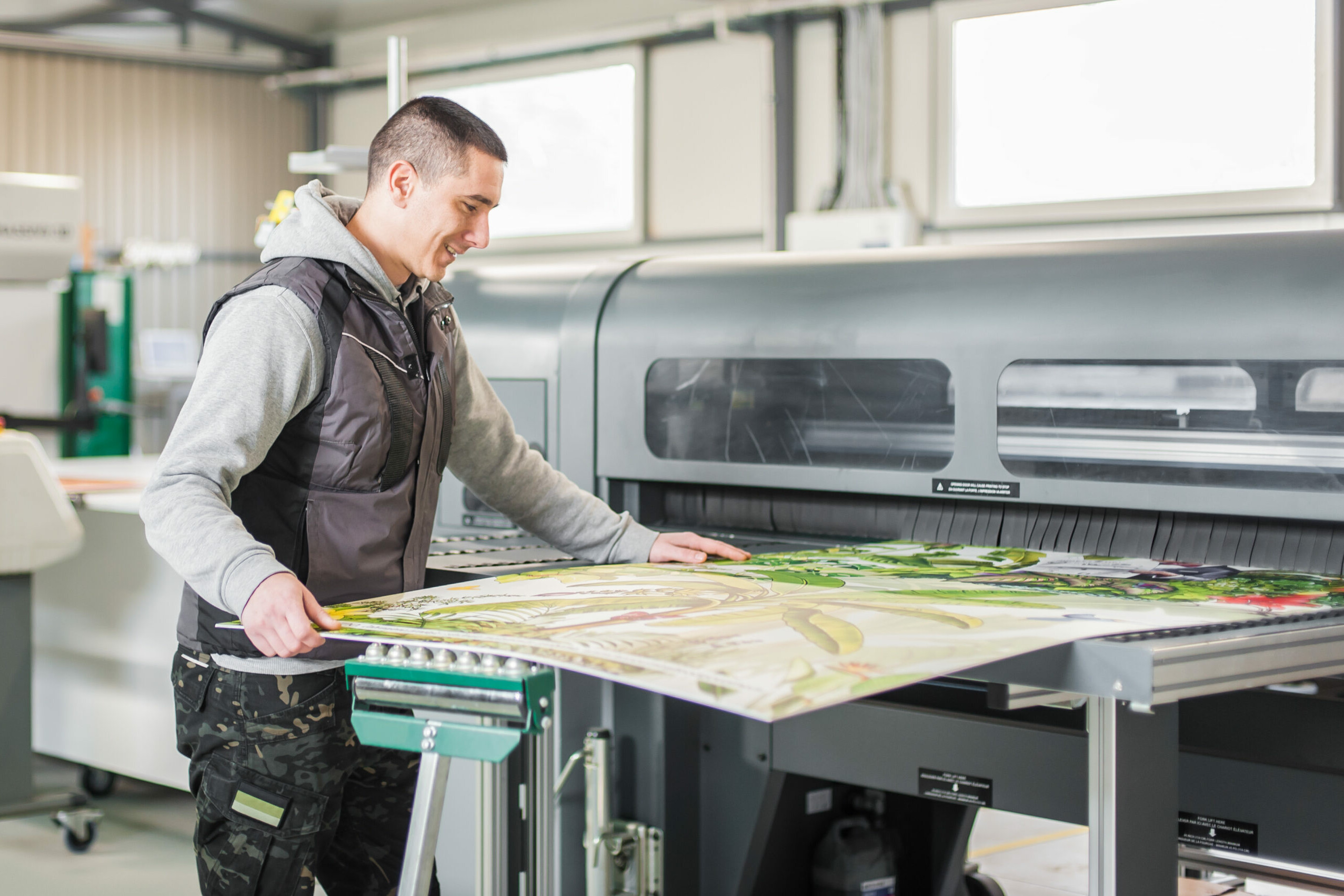
Based in Gateshead, you will be part of a small but driven team responsible for meeting production targets and high standards of quality on all printed materials. Initially starting out in our print finishing department, we are seeking someone who is keen to learn and advance their role as our business grows with the capability to move quickly into other production areas of the business and become a rounded player on our team.
Your primary responsibility will be to assist the team with the finishing aspects of various print jobs before training in print production.
Your duties will include:
The use of various finishing machines:
- Setting up of automated machines that cut, fold, trim, collate, laminate and binder
- Loading and adjustment of machines
- Ensuing the quality of the finish in the machines and where there are problems, stopping the machine and seeking help
Assisting with the hand finishing of various jobs:
- Packing of letters
- Collation of items to be packed
- Hand taping and stapling of jobs
- Operation of binding machines
- Cutting of large format jobs
Getting the finished job ready for delivery
Assisting with unloading, loading and recording of deliveries
Monitoring of stock levels and advising team leader when stock in low
Ensuring good housekeeping:
- Cleaning and keeping machines clutter free
- Empty re-cycle and general waste
- Ensure all floor surfaces are clear of clutter and waste
- Following all Health & Safety guidelines
Skills required:
- High level of physical skills required: Strength (ability to lift a minimum of 16kg) and manual dexterity
- Good communicator
- The ability to take instruction and retain information
- Strong attention to detail
- An organised approach to work
Skills not essential but desirable:
- Basic knowledge of print production
- GCSE maths and English C Grade or above
- Health and Safety
- First Aid
Personal qualities:
- Excellent timekeeping
- Trustworthy
- Methodical approach
- Enthusiastic
- Works well under pressure.
- Strives to continuously improve
- Determined
Education:
- Desirable but not essential – Maths and English GCSE C Grade (equivalent or above).
Because our business is print, it is important to us that you develop a core knowledge of all things print. Our apprenticeship provider will help you to develop knowledge about our industry and production processes before specialising in either print production or print finishing.
Full-time Apprenticeship
Salary: £183.00-£379.00 per week
Time to read more
The Importance of Bleed When Designing Print Materials
Cath Riley
Northern Print Solutions want to explain how bleed in printing projects affect a final design and ensure that you know just how to set up the bleed area for your artwork.
To those that don’t know much about printing and how designs for print work, the bleed area refers to the area of space around your design that will be trimmed by the printer when it comes to the final print.
This may not seem like a huge task but it is incredibly important to get this spot on as it will majorly impact how your final print will look.
The main reason for including bleed on designed printed materials is to avoid the white strips which run around the edge of your print, like they do on standard prints in the office.
White strips can occur because of movement during the printing process of your final document. If you’re printing official documentation, brochures, leaflets or similar you want high end quality, which is why you don’t want unsightly, amateurish white strips. They will instantly cheapen your product in the eyes of your customer.
A bleed area becomes instantaneously more important when we’re talking about background images and colours on print work. Ensure that they run into the bleed area so that you aren’t left with white strips on your work, if the product moves during the printing process.
It is also worth putting significant importance on the bleed area when you’re working with text on a brochure or flyer. Large headings can be impacted by the bleed area too, so ensure that your heading text appears tight to the side, so if the bleed area has an effect on the final print, your text won’t look like it’s ‘jumping off the page’.
Sizing Guide
There is a general rule of thumb within UK printing agencies that a bleed area is 3mm on each side, but it varies in the US and Europe. You must take into account the bleed area on all four sides when calculating the total bleed area for your document, so you will be adding both length and width to your initial page.
Remember to only let your background spread into the bleed area and keep all other content in the main frame of your document.
If you’re designing your project yourself ensure that you apply the bleed to the document before you start. Adobe software makes this particularly easy to do. Most design agencies understand the bleed process, but double check – or you could be paying heavily for their error in re-printing costs.
TIP: Trade Print Solutions will proof your document and ensure that bleeds, margins and other typical print requirements are correct before printing.
Remember that there is a difference between the bleed area and the margin. Margins are a good indicator of the space you have to work in and can improve the look of your final print. Although there are no rules for margin sizes – and you don’t even need to include one if you don’t wish to – they are typically either 3mm, 5mm or 10mm.
Time to read more
How to Achieve a ‘Rich Black’
Cath Riley
Rich black is a term given to the black colour that is produced by professional designers which does not appear grey.

When black ink is used in offset printing, it often appears grey, despite 100% black being used. Designers can add other printing colours to a black to make it known as ‘rich’ or ‘deep’ black.
How to Create Rich Black
The most popular choice is to use 100% black, as well as 40% cyan, 40% magenta and 40%yellow. A lot of people will not add the yellow percentage, however adding it can help to neutralise the hue.
Another choice is 60% cyan, 40% magenta, 40% yellow and 100% black. This will equal 240% and is the most that printers will not fuss about, adding more under colour can add problems on press.
Black Ink Overviews
Name CMYK
- Standard black 0C, 0M, 0Y, 100K
- Rich black 63C, 52M, 51Y 100K
- Cool black 60C, 0M, 0Y, 100K
- Warm black 0C, 60M, 30Y, 100K
- Registration black 100C, 100M, 100Y, 100K
- ‘Designer’ black 70C, 50M, 30Y, 100K
Summary
Rich black is known as being ‘blacker than black’ and although that is impossible from a colour theory point of view, it is visible in a printed piece. Using rich black and the visibility of it is based on a full understanding of inks, printing press and, in particular, the paper.
There are additional inks needed to form rich black, but this will obviously incur higher printing costs as a result.
Time to read more
5 Reasons Brochure Design Is Important
Cath Riley
Brochures have long been a staple of a traditional printed marketing campaign and they remain crucial despite the growth of online marketing initiatives. But why? Northern Print Solutions looks into brochure design.
The design of brochures remains a popular choice in the digital era because they remain incredibly versatile and particularly effective for service based, B2B industries.
Brochures are still important for the lead nurturing process that follows meeting somebody at a trade show or sales meeting – a well-executed brochure reminds that very prospect of your service and, additionally, what sets you apart.
- Enticing content
Although designers love to think that design is most important (in many ways it is), if the copy is littered with mistakes people will notice this over a poor design concept.
In the early stages, contemplate what style of writing you want to use for your brochure and how your readers will react to and engage with it. Copy comes as part and parcel of a strong design, so don’t consider them two separate elements – certainly not ones on different levels of importance.
- Pagination
For saddle stitched booklets there must be a multiple of four pages. Think about it, you have the front (page 1) and back (page 2) of the right side of the paper, with a crease down the middle to make the spine and then the front (page 3) and back (page 4) of the left side of the paper. So, the page numbering of your brochure will need to go up in ‘fours’ to ensure the correct ‘pagination’ throughout. Your brochure will be 4 pages, 8 pages, 12 pages, 16 pages and so on.
- Die cut
A die is a tool that cuts paper to any required bespoke size. There really aren’t any limits to using a die, other than the weight of the paper would govern how the die is made and applied to the stock. The die is built with metal pieces that pierce and cut the stock when direct pressure is applied – think of this as a huge cookie cutter!
The die cut option gives a totally unique finish. Although, we’ll be up front and say there is a higher initial cost to design and make your die, but once this has been made it can be used over and over again. Using a die cut design for a brochure front cover is one of the best ways to truly create something that people will want to pick up.
Surely, that’s the aim of every brochure ever printed…?
- Finishing and stock to match your message
There are hundreds of different ways to add a spark of individuality to your brochure, from hot foiling, embossing to die cutting and lamination.
Laminating is a process that covers the stock in a film and gives a great finish, as well as offering longevity to the brochure. The most common applications are matt, gloss and soft touch laminate.
Top tip: Laminating is also ideal for ensuring the print doesn’t crack around the spine if using a heavy print coverage of colours.
- Ensure your finishing and stock match the message you are sending.
We can’t tell you exactly what that will look like without understanding the project in depth first but as a general rule; If you are trying to exude high quality, excellent workmanship, selling a high class offering then using a heavy stock in brand colours with expertly implemented finishing is the way to go. Think about how much you want the reader to invest in you – you can’t claim to offer the most high class business proposal using the very cheapest print you could find.
In the same respect, a busy tool company selling discounted tools probably has a very different criteria. The criteria being to display as many of their discounted items as possible and get them to as many people as possible. Huge print runs, quickly turned around means a much cheaper stock is needed. The message is quick deals here and nothing more.
The last word
It is worth bearing in mind that a brochure with lots of pages (in quantities of four, don’t forget) will need to be bound in a different way than one with 20pp. The most basic and very suitable binding option is saddle stitch, which is when staples have been threaded through the spine to secure the pages.
For all brochures depending on the weight of the pages, you really want to look at a different binding option on anything from 32-48pp so you don’t get that horrible bowed page look in the middle of your beautiful brochure. A perfect bound option would be ideal (this does not need to be a multiple of four pages).
There are many different binding options whether your little beaut of a brochure is 16pp or 140pp. So, if you are looking for something a little different or just want to see how the leaves will look, give us a shout and we will be happy to help!
Whether that be wiro, perfect binding, lay flat binding, side stitching, plastic coil binding, tape binding, post binding, velo binding, ring binding. Ready to buy now? VISIT OUT ONLINE SHOP or if you need a bespoke quote….
AlternativelyTime to read more
Never Tear – A Paper Revolution?
Cath Riley
This month we’re going to take a closer look at an incredible product that we have to offer, and one that we think not many people know a whole lot about – Xerox’s Never Tear Paper.
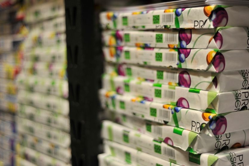
It’s not often that a product as ubiquitous as paper sees such re-design and innovation that it changes the majority of it’s recognisable properties, but when Xerox launched ‘Never Tear’ in 2006 it did just that. Boasting characteristics as counter-intuitive as ‘tear-proof’ and ‘waterproof’, it really has to be seen (and used) to be believed. (In fact, as can probably be expected when such claims are made, the samples have proven to be very entertaining in the office during ‘testing’ – we’ll leave that to your collective imagination.)
In a practical sense, what the product offers is durable, practically imperishable, paper products. So for long-term items for every day businesses, such as training manuals, ID cards and guidebooks, your money is impeccably well spent. Things that would have previously required yearly investment, now become items that potentially last a whole lot longer.
In a more focused sense, Never Tear offers many obvious benefits to those working in the hospitality trade. For example, for the restaurant industry we can achieve wipe-clean place-mats and menus in a way that any potential liquid damage to these items can be reduced to almost nothing, whilst remaining lightweight, hard-wearing and easy to store.
In the hotel industry, everything from ‘do not disturb’ notices to room service menus, and all of the other small print pieces that used to need replacing during every room re-fresh, now becomes longer-lasting durable items – which, as a result, could possibly save you a fortune.
On top of all of it’s practicality, Never-Tear also has a wonderfully lavish feel, so it can also be utilised for high end brochures that may not have the luxury of spending their lives in a comfy showroom. We’re thinking things like pre-build sales brochures for luxury apartments etc.
Now, unfortunately for us in the print trade, such great paper comes with great responsibility. Meaning that it’s immense durability does come with the unfortunate side effect that it is not the easiest stock to print on. But, not to worry, we at NPS have worked very hard to develop methods that achieve unbelievable results that we are very proud of and in fact, are just as good as anything that can be achieved on ‘run of the mill’ paper.
We are so proud in fact that we would go as far to claim that we achieve some of the best print results on the Never Tear paper stock that can be achieved in the entire region.
So, in summary, Never Tear is an incredibly exciting product and the uses for this paper are as far reaching as the world is wide, so we’d love for you to challenge us to see what we can create. So please get in touch and let us see how you can implement Never Tear and change the way your business utilises printed products.
Time to read more
10 Things You Need To Consider When Creating Your Wedding Invitations
Cath Riley
We often find ourselves printing wedding invites for a couple’s big day. So we put together this handy guide of 10 things to consider when creating your wedding invitations.
As the old adage states, there are two events that will likely happen during your lifetime that are guaranteed to cause such a stress that you could in fact be shortening your metaphorical waking hours by even partaking in them; they are, of course, buying a house and planning your wedding.

With the nuptial season in full flow, what’s certain is that there is a whole new crop of love-addled couples ready to pull the trigger on the large gauge cannon that is your wedding day and believe us you’re going to need help. So, grab your confetti box, pop the Prosecco and strap on your white garter, here’s ten tips to keep in mind whilst creating your wedding invitation:
It’s the introduction to your ‘Big Day’
In most cases, the invitation is the grand opening number to the fantastical theatrical production that is a wedding and, as is the case with all big openers, this is your chance to make an impact and set the tone for the rest of the proceedings. Think about who you are, the message you want to convey, the theme of your wedding and the colours that will be present in the venue. All of this can be tied together and referenced in one small envelope.
Say What?
No matter whether your personal style is sensational swinging sixties or exquisite, effortless elegance, clarity is the absolute key. Keep font sizes as large as you can and type face choice should always be something that can be easily read by anyone. It could mean the difference between a full turn-out and half of your guests turning up to the wrong town on the wrong day.
Also, we’re not one’s to stifle your creative process, but the communication of information is key to a successful invitation, so don’t let looks hinder or obscure the content.
Say Who?
The first of many issues of confusion that can come from non-specific wedding invitations – let people know clearly who you mean to invite. Is there a non-specified ‘plus one’ for single guests? With families, do you mean for children to be invited? Is a relative overly attached to a family pet and need reminding to leave the unwanted animal at home? What ever the specification people need to know, so tell them, (and don’t be afraid to mildly offend people, this is your big day after all!)
Say Where? Say When?
As simple as these issues sound, nothing is more important than telling people where they need to be and when. This means including full addresses and postcodes for wedding and party venues. You will be surprised how many cities, towns and even villages have several churches and event spaces with almost identical names.
When informing people of important times, one of the stumbling blocks can be confusion as to when guests should arrive. If you plan to be in front of the vicar or registrar at 12:30 then you need people to arrive before that time, so it’s important that this information is included. The last thing anyone wants is a continuous arrival of guests as the groom stumbles through the vows.
The pen is messier than the sword.
In the modern era of PCs, laptops, tablets and smartphones it’s fair to say that most folk’s handwriting is not as elegant as perhaps it used to be, and it’s also perhaps inevitable that someone is going to have to write the names/addresses on the invitations and envelopes. So consider who that might be – perhaps a Granny still possesses the dark arts of fair handwriting in Indian ink, or maybe employ the services of a professional calligrapher. Whatever you do, keep in mind that an invitation’s first impression is the writing on the front of the envelope.
Check again and again. Or write another cheque.
As anyone in the print industry will tell you, the frustrating truth is that any printed document always needs one more proof read, no matter how many it may have already received. Joiners and carpenters also re-enforce this metaphorical mindset with the wonderful working attitude of ‘measure twice, thrice, four times and cut once’. So, as the title states, check the invite, then check it again, have someone else check it, leave it a couple of days and then give it the final check. Then perhaps once more for safety – and again just before you send the email to approve the invitation.
Give the people time.
The one thing that you absolutely want on your wedding day is to have all of your most cared for friends and family in a room, in the same place and at the same time to share in the happiest day of your lives. Now, as simple as this may sound go and try and arrange a simple dinner with even a small set of friends and family, at short notice and see how that works out? Exactly. People are difficult no matter how important your happiness is to them, and the best way to make sure everything goes to plan is to give people as much notice as you possibly can. How much time is your personal choice, but the amount of time should at least be best described in the unit of months, not weeks!
Spares and Repairs
What is an absolute given with the game of chess that is choosing who and how many to invite to your wedding, is that you’re going to need spare invitations. Whether they ‘go missing in the post’, or the likely ‘second round’ of invites to people who didn’t make the first cut, but are now bumped up due to a couple of selfish aunties and uncles being on an ‘un-movable’ cruise of the Caribbean (can you sense the personal experience with that one?) Or, perhaps you might want to keep a few in your memory box. In any event, printing only the numbers that your initial guest lists tells you that you will need is never enough.
To gift, or not to gift? That IS the question.
The final potential footfall in this list is with regards to how you may want to deal with the sensitive matter of wedding gifts. As is the case with the ‘who to invite’ conundrum, this is your big day and you should not be ashamed, or afraid, to set out exactly how you would like this aspect of your wedding to transpire. NOBODY wants three toasters, especially in this day in age of couples living together long before they get married and likely investing in their own much loved toasting device. But, as with the big ‘who’ question, you need to be clear in your instructions and remember, people really do want to know what they should do to contribute and make you happy on your big day.
‘Retournez S’il Vous Plait’?
Finally, make sure it’s clear how your intended guests can inform you of their wish to be part of your wedding. In this digital age this can take many forms; Facebook pages, text message groups, emails and even, believe it or not, hand written letters. So, make sure all of the relevant addresses, weblinks and telephone numbers printed are accurate and obvious. Family wars have been started over less than an un-received wedding RSVP and the resulting chaos.
There you have it, our take on what to look out for when creating the always important wedding invitation. We’d love to be a part of the process and help you even more by achieving the best quality print for your invites and we can also be on hand to help guide you through a couple of the points we’ve mentioned above. (Not your relatives though, you’re on your own with them.)


